Leucent
College Info Adviser Redesign
Intro
Leucent being a small firm, I wore many hats in the company. It gave me a unique perspective in understanding the business side in relation to design. I worked with my partners with the redesign as well as contributing to the overall strategy.

Discovery
Research methods used in the discovery phase for this project were:
Stakeholder interviews with marketing, business development, and advertising partners
Surveys sent out to our email lists
Feedback forms from our main site and email unsubscribes
User Interviews
speaking with our stakeholders
I spoke with our head of marketing, head of business development, and a few of our advertising partners to better understand our business.
Leucent’s revenue model is reliant on generating leads for advertisers in our email lists and site. Basically, a potential lead, or user, is brought through paid traffic channels through a lead funnel site, into an email campaign. When user’s click on articles or sign up for schools in email advertisements is when the value exchange happens - revenue is generated for the organization, the user signs up for a potential school of interest.

Understanding Our Users
Our advertisers gave us access to users who had just enrolled into school.
Leveraging user interviews along with data from previous campaigns allowed us to extrapolate our user’s needs, goals, motivations, and pain points.
For example, one user segment we were able to identify was older, single mothers that are looking to increase their skill-set. Education gives our users an opportunity to make more money they can potentially make, meaning more upward economic mobility to provide for their family. Some of the pain points they have with programs are costs, flexibility and time. The persona created below is an artifact of the calls and as well as our own assumptions based on previous data points.

Mapping the Customer Journey
Now with a good understanding of the user, I worked with my partners to understand the different functions of the business. From there, I mapped out a customer journey map that looks at touchpoints and how they relate to both the customer and the organization.

Key Takeaways
Based on our research, the biggest takeaway was not just taking into account email opt-ins, but also thinking about enrollment rates for our advertising partners. Some takeaways on how we could improve:
We needed to improve our messaging to better highlight our value to our users
We need to give users the ability to choose the types of programs they are interested in
We need a way to filter traffic sources in order to capture the best quality traffic as possible.
Finding The Right Message
The first touchpoint for our users was our ad messaging. We tested hundreds of messaging variations.
We utilized Meta Ads for our initial testing. With our inital ad tests we utilized a color-blocking design strategy to test the messaging. There are multiple benefits to using color-blocking for initial ad tests:
It acts as a pattern interrupt when the user scrolls through their mobile device
Removing as much of the visual as possible allows us to focus on the messaging
Multiple messaging variations can be tested very quickly
After finding the most successful copy, we now had a baseline click through rate to follow and could now move on to visual design. After multiple design and testing iterations, we found a few winning design layouts.


Testing The Site
For the initial landing page, our main KPI was opt-ins. To improve on email opt-ins, we wanted to improve on decreasing friction, improve site creditability, and highlight the benefits. For the main landing page, we split test variations with input fields, adding supporting copy and benefits, and visual design refresh.
Input Fields Test
Email Field Only
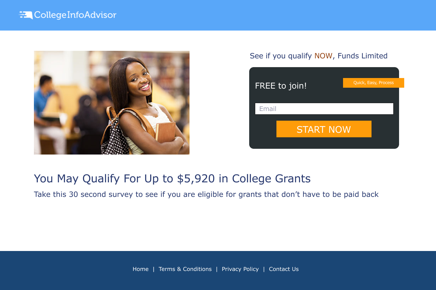
Email, First Name (Original)
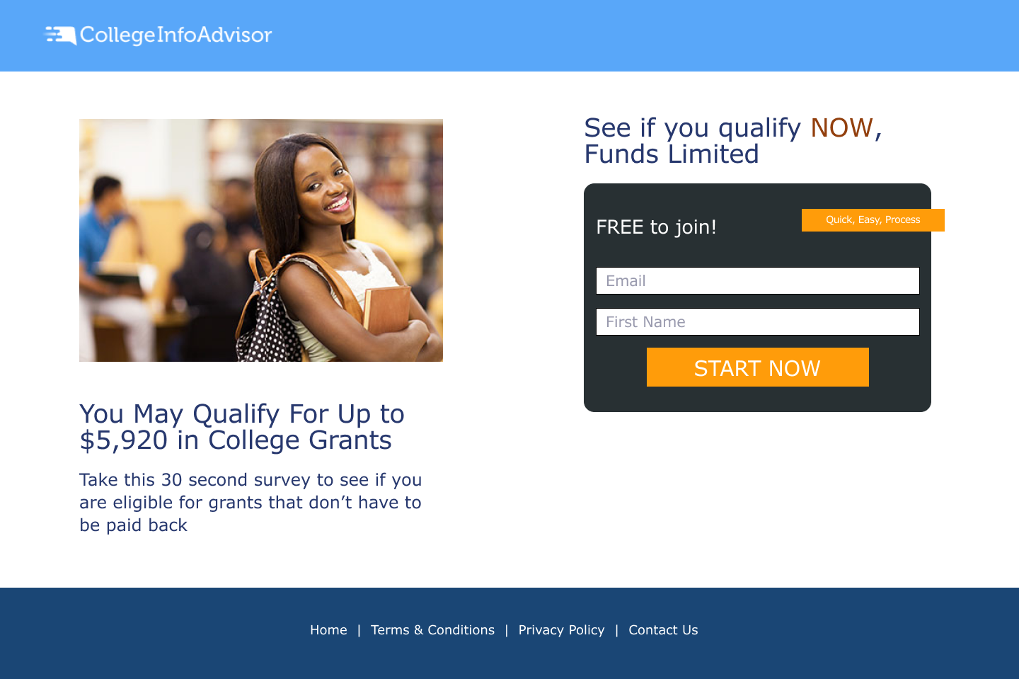
Email, First Name, Last Name
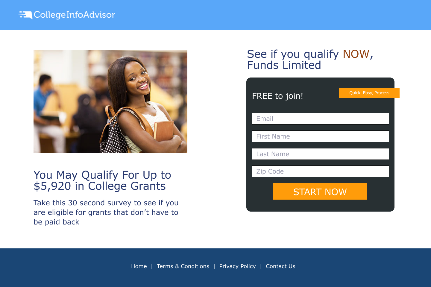
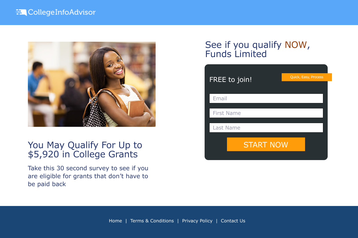
Email, First Name, Last Name, Zip Code
Email, First Name, Last Name (One Button)
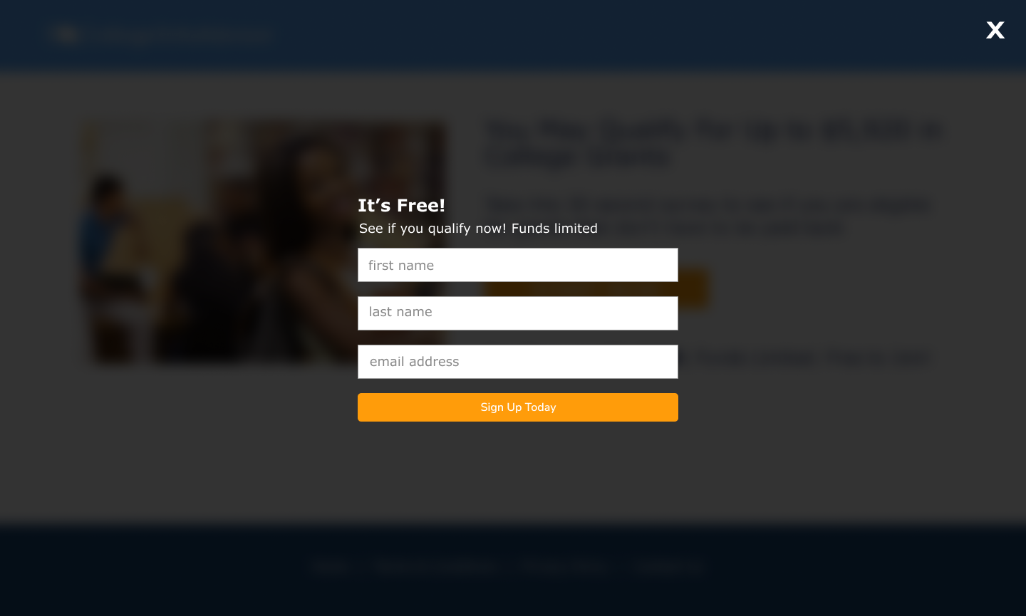
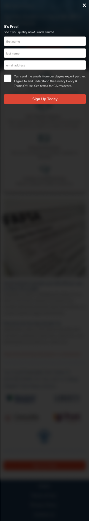
Email, First Name, Last Name (One Button) Modal
Our original landing page had two input fields (Email, First Name). We tested 1 input field, 3 input fields, 4 input fields, and a button that would display an overlay with 3 input fields on the site. Our goal was to see how much information we could capture on the front end without sacrificing much opt-ins, with a threshold of 5%. The reasoning behind this decision was based on the fact that more personalized information made each lead worth more. Our hypothesis for our split test we could capture Email, First Name, Last Name without much difference in opt-ins.
Input Fields Test Insights
The results of our split test against the control, based on 1000 impressions:
Variation A (Email Field): +3%
Variation B (Email, First Name, Last Name): -0.5%
Variation C (Email, First Name, Last Name, Zip Code): -6%
Variation D (One Button w/ Overlay): +7%
With this information, we decided to go with Variation D and go with one more test to see number of input fields would affect opt-in rates with this variation. Using Variation D (One Button w/ Overlay & 3 Input fields) here our our results:
Variation A - One Button w/ Overlay & 1 Input fields (Email) : +2%
Variation B - One Button w/ Overlay & 2 Input fields (Email) : +1%
Variation C - One Button w/ Overlay & 4 Input fields (Email) : -8%
With this data, the most successful variation was the one with 3 input fields on an overlay, activated by clicking the “Start Now” button.
Content Test

3 Benefits

4 Benefits

4 Benefits (v2)
Schools

Supporting Content (Image)

Supporting Content (No Image)
To increase our opt-ins, we hypothesized that adding clear benefits and supporting copy would help increase our opt-ins. The benefits and supporting copy variations we actually tested on our ads and email copy extensively, so we hypothesized they would do well, but it was more of a matter of whether they would perform similarly if added to the site. Adding schools, we hypothesized we could use the school brand power to increase our credibility, thus increasing our opt-in rate.
Content Test Insights
Using our original design as the control for these tests, these are the results based on 1000 impressions:
Benefits Variations
Variation A (3 Benefits): +1%
Variation B (4 Benefits v1): +3%
Variation C (4 Benefits v2): +2%
Supporting Copy Variations
Variation A (Image): 8%
Variation B (No Image): -3%
School Variations
Variation A: +10%
We were a little surprised that the Supporting Copy Variation with no image actually did worse than the control. The best performing variations were Benefits Variation B, Supporting Copy Variation A, and School Variation A.
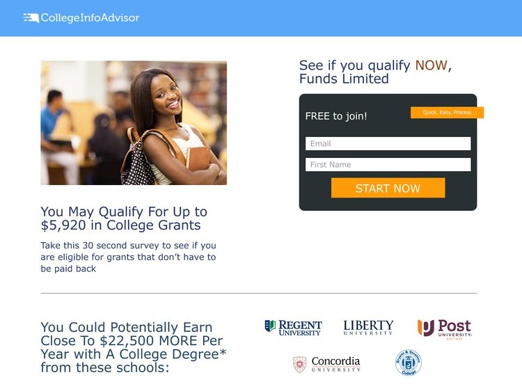
With put together the best performing input field variation along with the best content variations and split test the content positioning. The winning variation. Testing against the original design as the control, we were able to increase opt-in rates by 15% with the variation below:

One issue we were seeing with this variation is users were having to scroll back up in order to sign up. We hypothesized if we added CTA at the bottom of the page, we could increase our opt-in rates. We tested the new design without a button against a new design with a button and saw a 20% increase in opt-ins with design below:

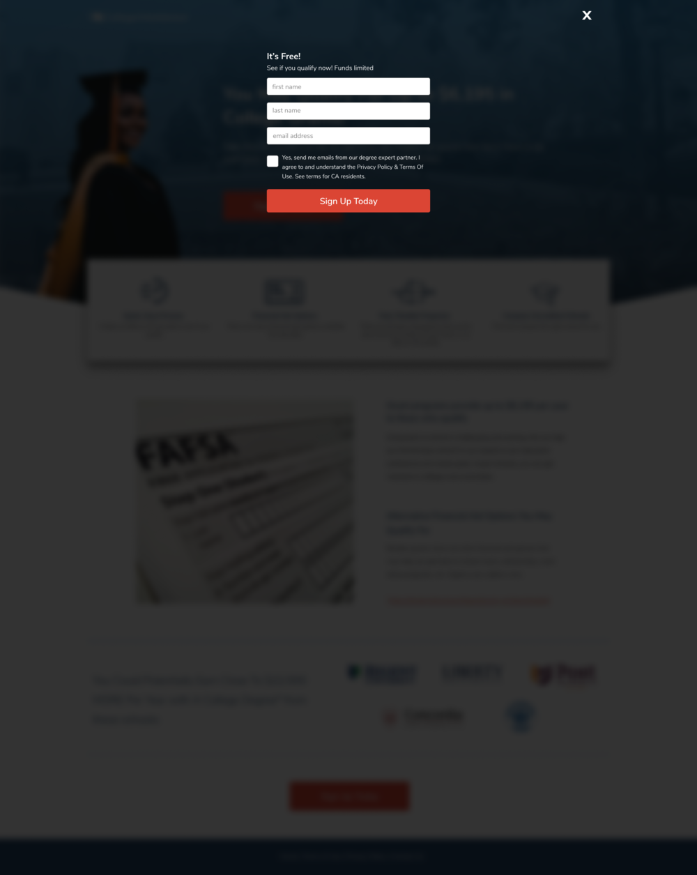
Once we optimized on the layout and content, we did a visual design refresh in order to improve our credibility and thus our opt-in rate. We based our visual design direction on our best design layouts and themes. We created two additional visual design variations and tested it against our new design as the control.
Visual Design Test Insights
Against the control, we saw a lift of 15% with Variation A and a 10% lift with Variation B. We decided to move forward with Variation A and do one more split test regarding button color. We ended up going with an orange red button color in the final version.

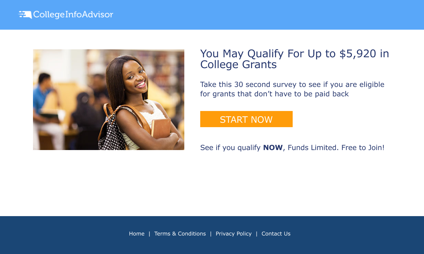
Original

Final Visual Design
User Segmentation
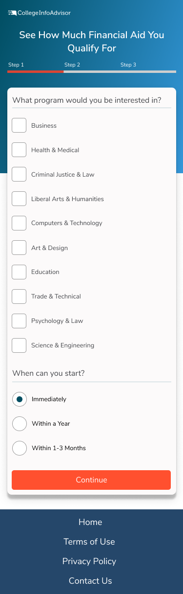
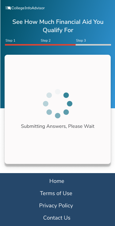
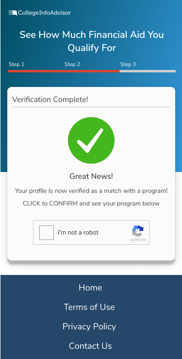
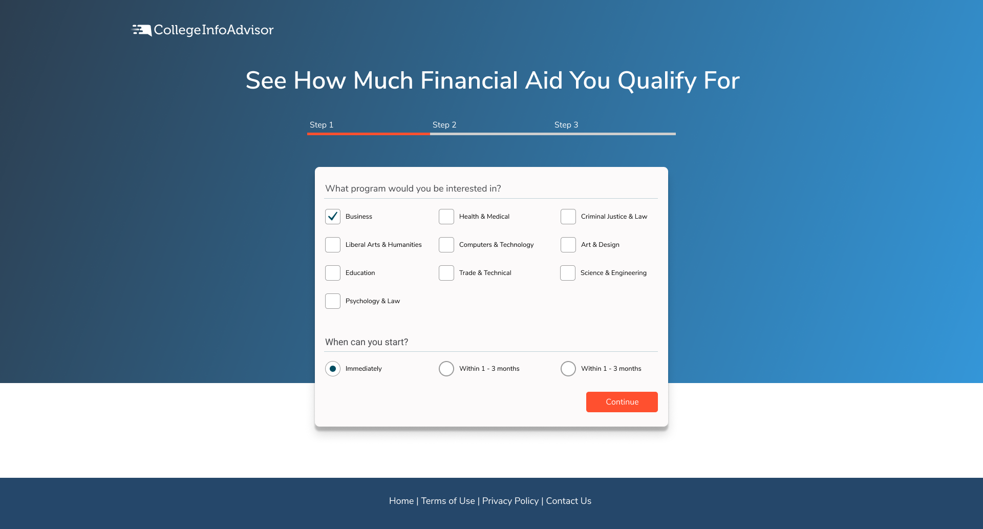
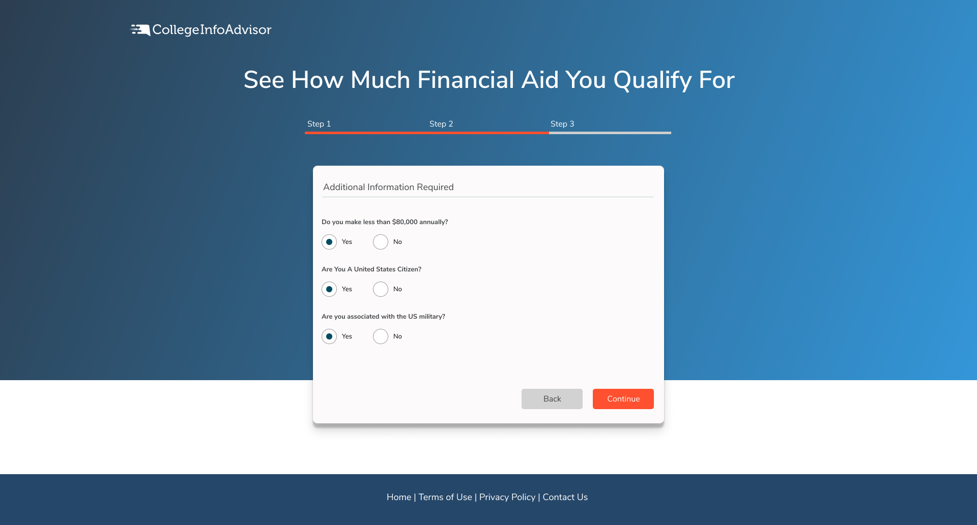
The original landing page had only an opt-in form. Based on what we learned in the discovery phase, we added this next flow that allows users to select the types of programs they could be interested in, the length of the program, as well as some questions regarding financial aid eligibility. This segments users into different email lists.
Desktop Wireframes

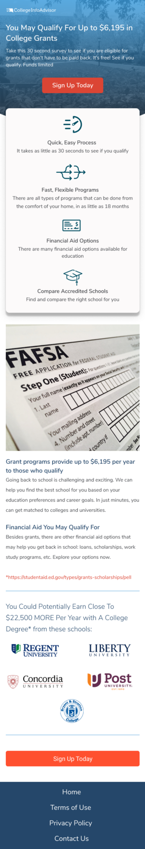
Landing Page
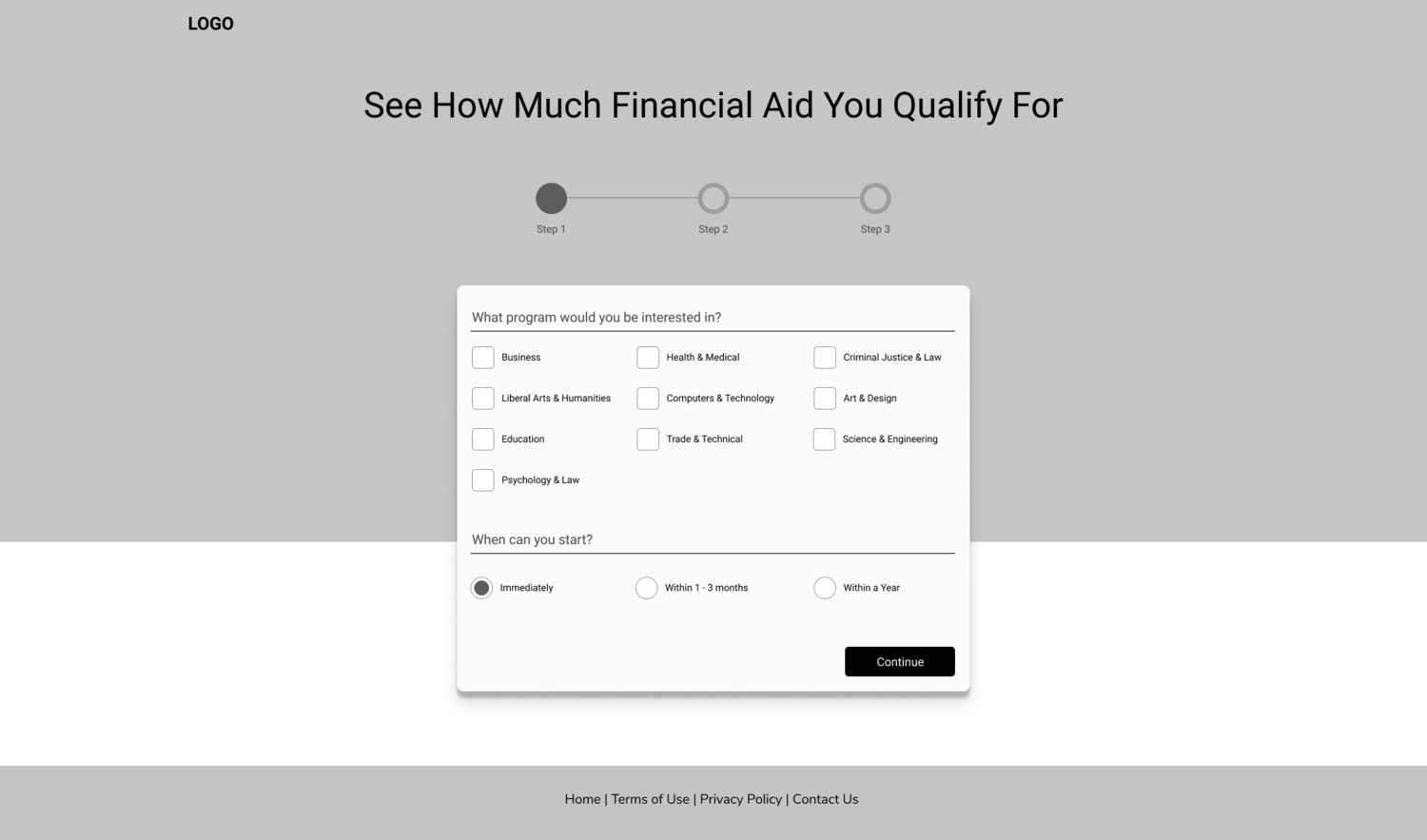
Step 1
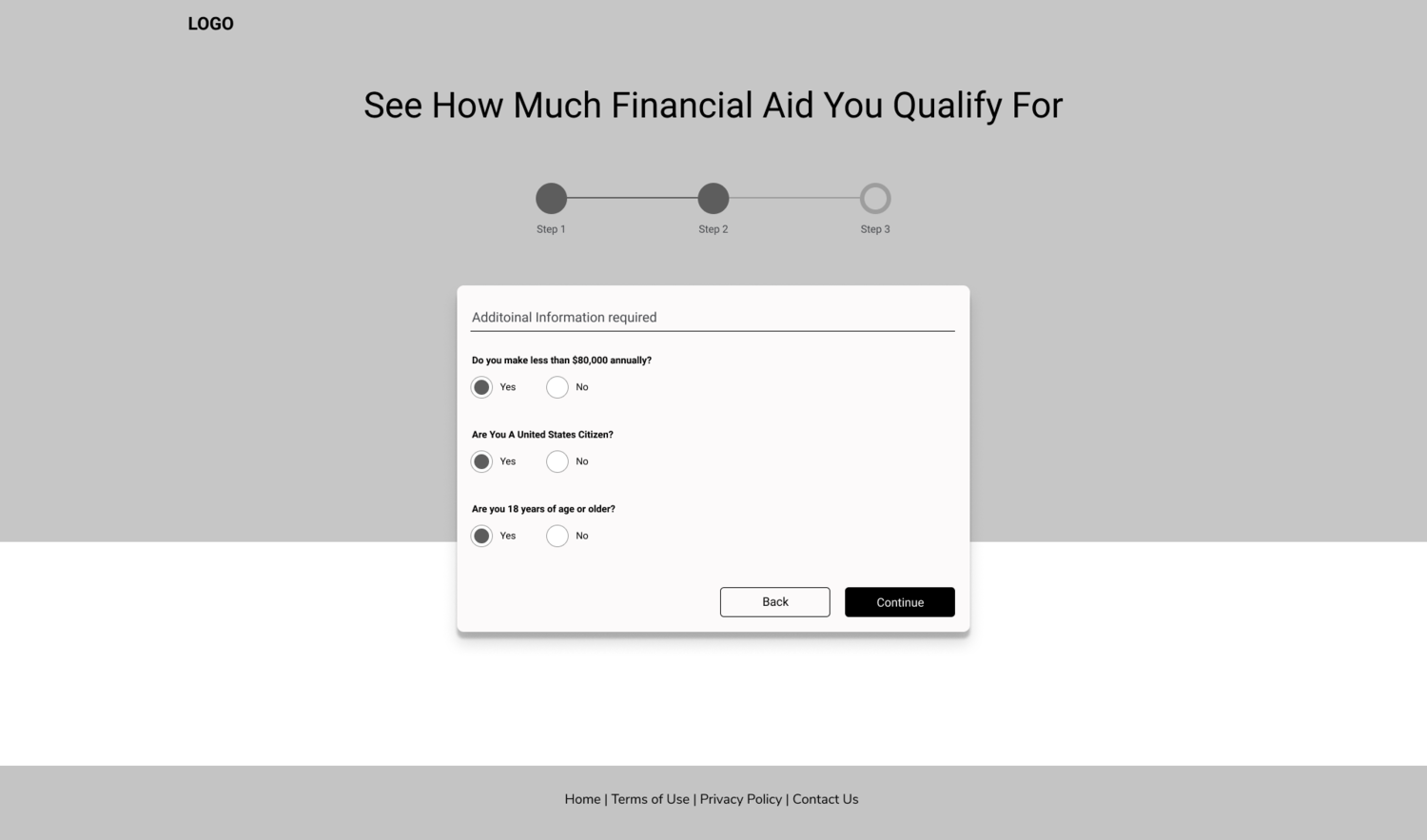
Step 2
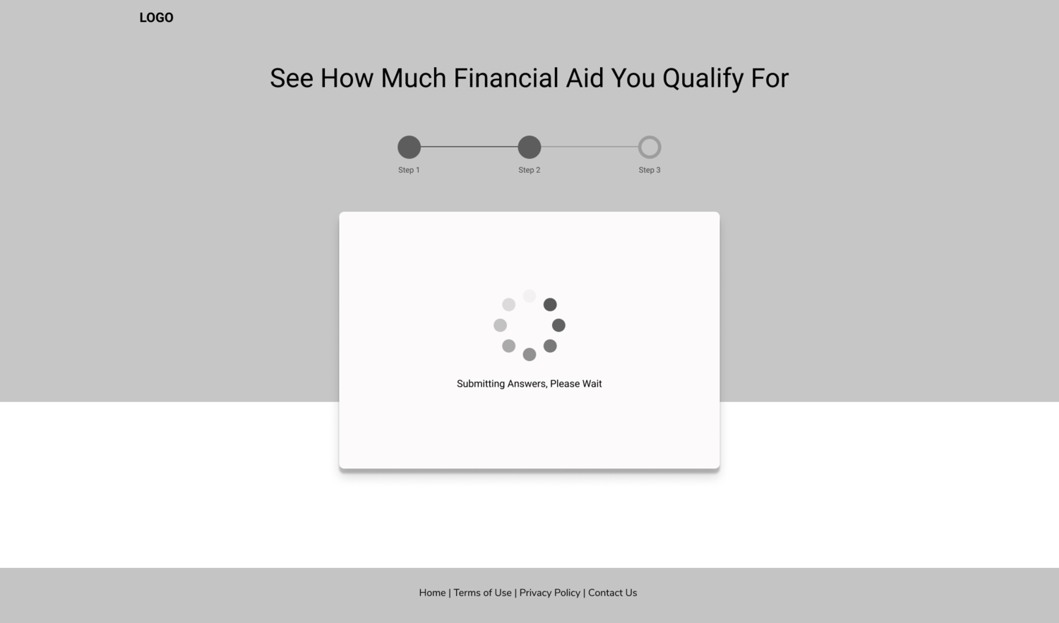
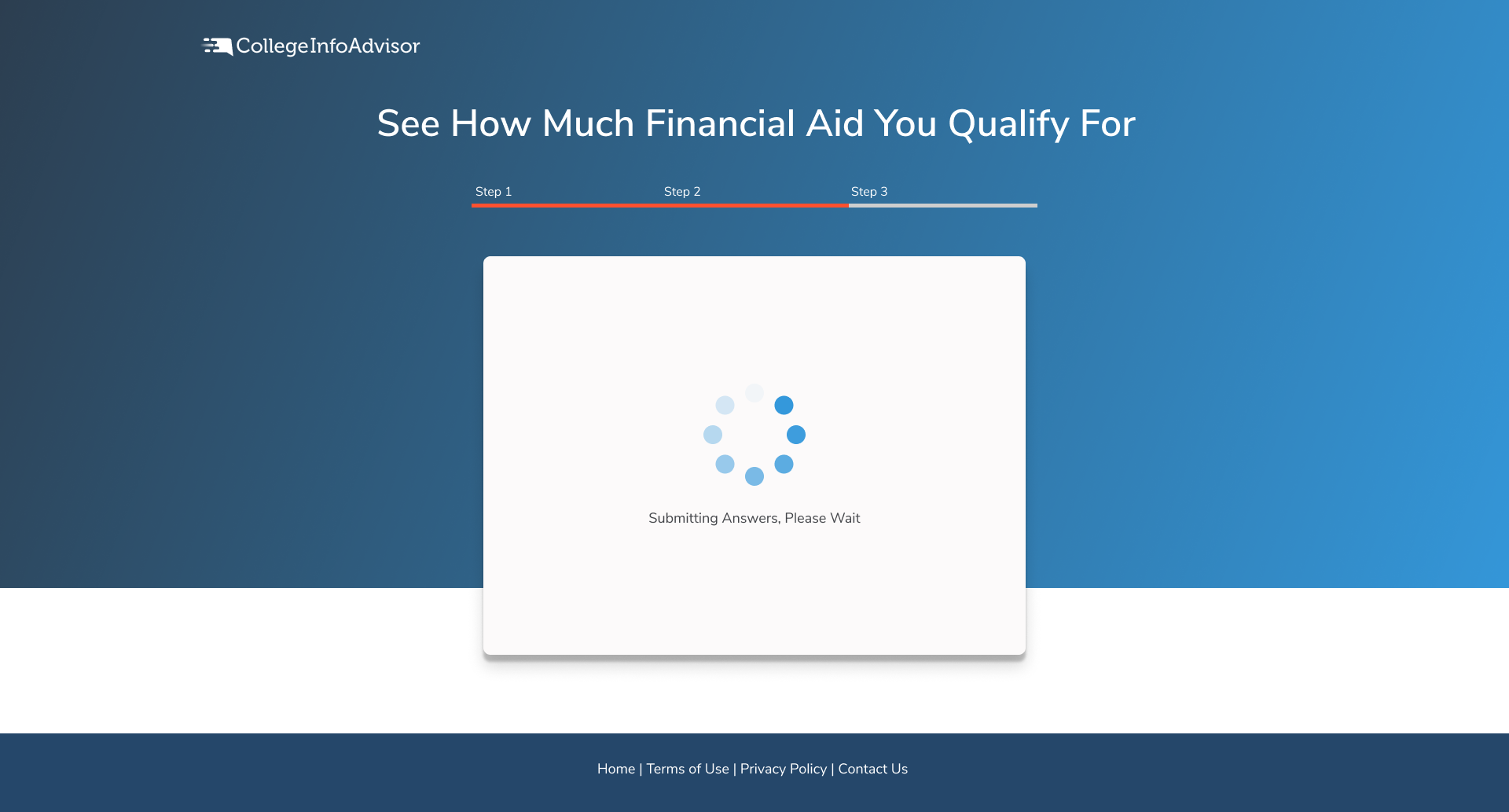
Loading

Step 3
Mobile Wireframes
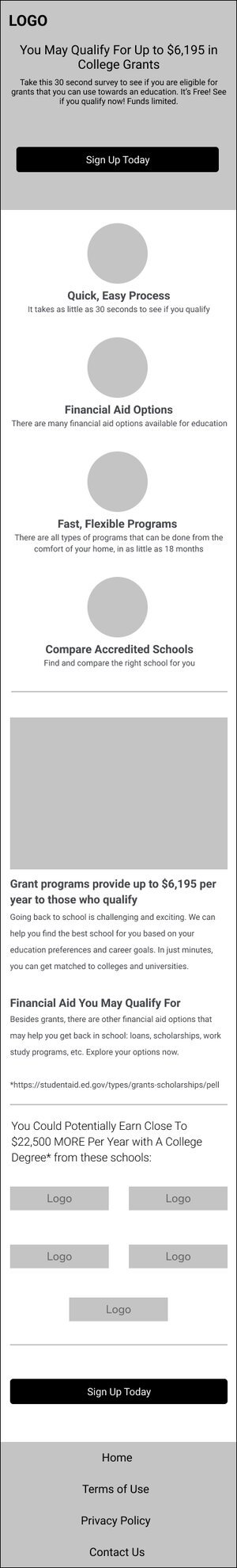
Landing Page
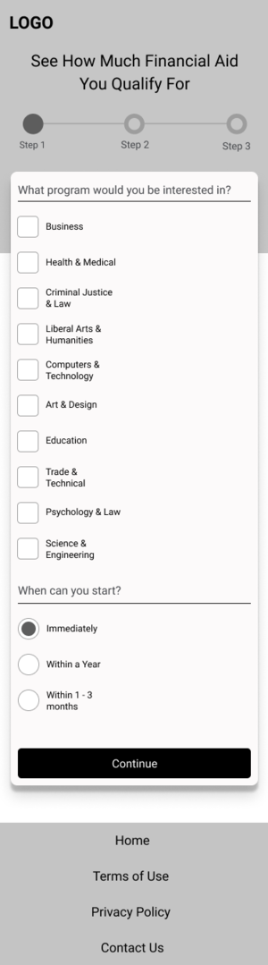
Step 1
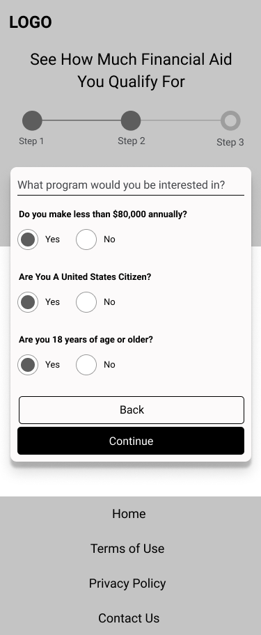
Step 2
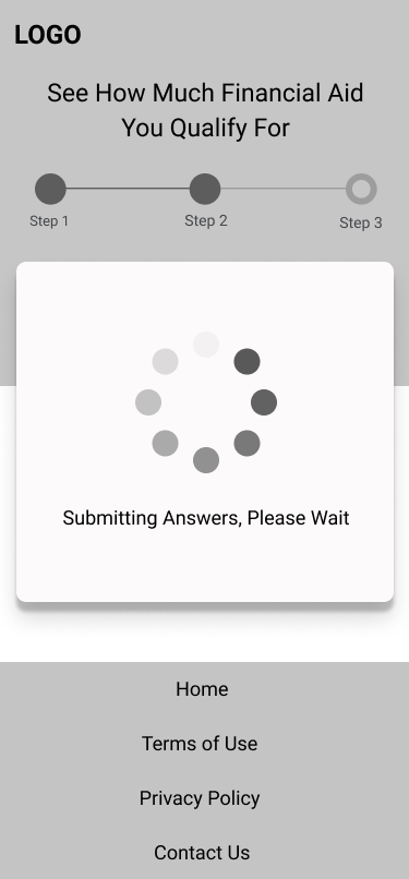
Loading...

Step 3
Improving Traffic Quality
One issue our organization was having was improving traffic quality, specifically with our affiliate network partners. Majority of our traffic was coming from our affiliate network’s publishers, which can be great value but sometimes the quality is not great. For the redesign, we added two things to help improve our quality.
1) When the user enters their email address, their email address is checked for validity via API through Email Oversight. If the email is valid, they will be allowed to submit their information, otherwise there will be an “invalid email message” status thats given and they will not be able to submit their information.
2) Once the user submits their information, their IP address is checked against a list of known low quality traffic IP addresses (VPN, bot traffic, etc…)
If the IP is not on the list, they are taken through the segmentation flow, which has an advertisers landing page at the end of it.
If the IP is on the black list, they are still taken through the segmentation flow and the email is still captured, but they are segmented into a different email automation list. There is general offer that pays per click, at the end of this flow, so we are still capturing this data and generating revenue on it.
CIA Flow (Mobile)

CIA Flow (Desktop)

Final Visual Design Implementation
CIA Flow (Mobile)

CIA Flow (Desktop)


Impact
Depending on the traffic source, we were able to to increase the opt-in rate between 40-60% against the original.
The addition of the email validation and ip filter had an big increase in our enrollment numbers, with a 15-18% increase lift. Due to the higher enrollment rates our site was generating, the advertiser was willing to give us more marketing budget for the following months, which translated to an additional 10-12% increase in revenue the following months after.
It’s crucial to understand your users and how your business can serve them at every touch point of the user journey.