Wells Fargo
Wallet & Card Management
Role
I was the visual design lead for the Wells Fargo mobile wallet and card / token management feature. Wallet allows users to pay for goods using their Wells Fargo cards and mobile devices. Card / token management gives user’s the ability to enable / disable cards and electronic tokens. I collaborated with interaction designers, copywriters, product managers and developers in designing and launching these features.
mobile wallet (ios / android)
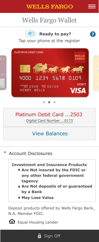
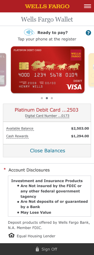
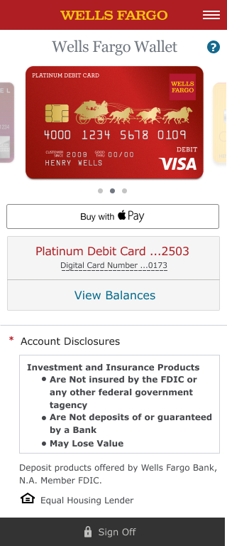
The mobile wallet features a carousel that makes it easy to change cards. There is a balance panel that lets a user hide and view available balances and cash rewards (if using an applicable card). User testing revealed that people did not like having their balances always showing, so the view / hide balance interaction was implemented following that feedback. The way user’s pay is specific to the native platform. On IOS, the user taps on the “Buy with Apple Pay” and is taken through Apple’s payment flow. On Android, the user would place the phone near the payment device and be taken through the Android payment flow.
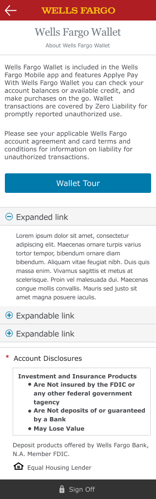
Card Provisioning & Management
In addition to the mobile wallet, I also worked on the visual design for card provisioning and management. User’s can add cards to their Wells Fargo Wallet and also turn their cards on or off.

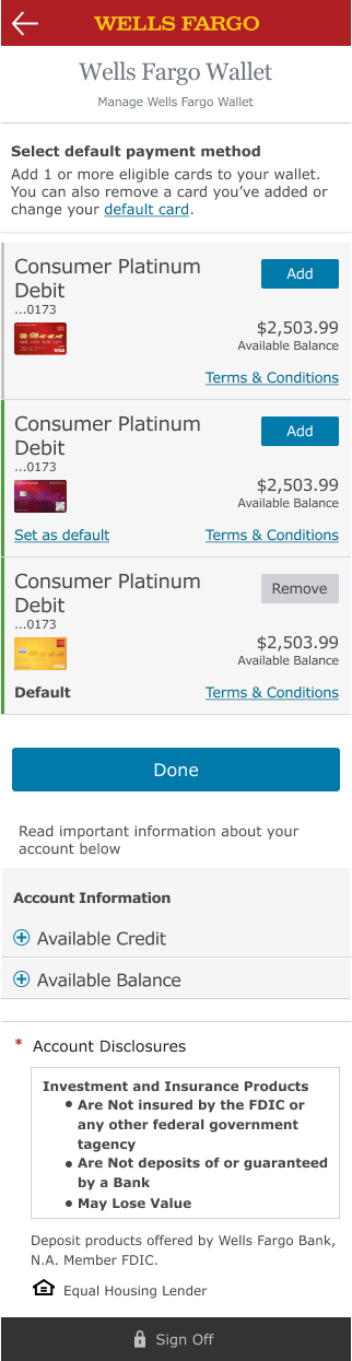
Card Management (Desktop)

User’s can also log in to their Wells Fargo account to manage their cards, as seen below:
components
I designed components specific to wallet and card management and worked with development to insure they were properly implemented. This isn’t a comprehensive and does not include Wells Fargo’s design system in it’s entirety - just the components that were created for this project.


A More Inclusive Design
We worked with an accessibility expert to make sure our design was ADA compliant. For example, people with visual impairments may find text difficult to read due to poor contrast ratios, so we chose colors with a contrast ratio of at least 4.5:1. For example, the primary button in the component below has a contrast ratio of 4.85:1, and the secondary button has a ratio of 5.55:1.

For alerts and messaging, we made sure to design them visually not with just color, but using a combination of color, text messaging, and symbols.

ADA compliance also includes making sure screen readers are able to the screen properly. For example, we ran into an issue with our dotted line links, where the screen reader was outputting “dash dash dash dash” repeatedly due to the implementation. The dotted lines in the digital card number link had to made into an asset to insure the text was read properly.
